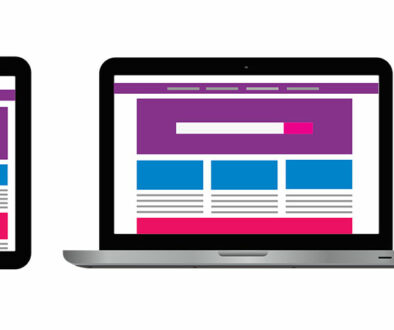
Do Mobile Navigation Menu Design Matters to Attract People?
Yes, it does! The mobile navigation menu is there for a purpose which acts as a bridge between the user and the website. Since the user explores the website through navigation or categories, it is important to guide him in a right direction. A messed up and cluttered navigation menu with broken links is a big NO to the web design.
Although there are various types of navigation menu bars available, yet you have to make your pick to enhance the overall appeal of the website. A good navigation design provides an enriching experience to the users, let’s discuss the functioning now:
Function of the Navigation Menu
Provides better structure
Navigation menu acts like a sitemap which has all the necessary information about the website. A navigation menu displays the content in an orderly manner in front of users and also the structured arrangement looks visually attractive to the eyes.
Display the Important Functions
With a good navigation menu design, you can catch the immediate attention of the viewers. For example, you deal in baby dresses and to highlight the core thing, put various types of dresses in the navigation menu. Just putting the baby dresses will not work rather highlighting all the dresses would work. The proportion should be in a controlled way to avoid the viewers’ distraction because too heavy navigation menu would go opposite your set strategy.
Simplified Browsing
A good navigation menu allows simplified browsing of the website and also provides a smooth path. Hopping on to the navigation directly seems much easy instead of scrolling it through to find the product. Want to buy a particular product? Simply follow the category>sub category and filter down the search to locate that product. With an easy navigation menu, the conversion rate of the product will increase.


