Web Design Trend: The Ghost Button

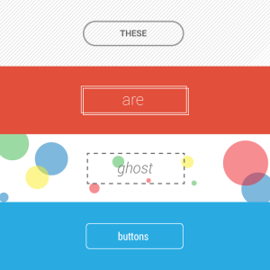
One website design trend that has been popular for a couple years is the ghost button. You’ve probably seen them — ghost buttons are buttons with transparent backgrounds. They have borders and text in the middle, to indicate that they are, in fact, buttons. They’re effective when they’re done right, otherwise they can just confuse people. They became popular as the “flat design” movement picked up with Apple’s iOS 7 update a couple years back. The term however, was coined by a Tumblr blog, called Websites with Ghost Buttons.
Why Ghost Buttons are Popular
They’re easy to make and integrate into a page’s design. Ghost buttons, since they’re transparent, blend into the design right away. Because of this, they’re also easy to make. There aren’t any visual decorations or animations associated with ghost buttons, so any designer can create one. Also, they go along nicely with clean, flat designs. Since flat designs are very popular right now, a ghost button is the perfect button for pages. They aren’t distracting, which allows the rest of the page design to be the focus.
How to Create a Ghost Button
You should always integrate it as a secondary button. A ghost button shouldn’t compete with a primary “call to action” button. Instead, it should be something such as social media links, or other secondary content. If you want to be sure users will see the ghost button, you can use a hover animation. For example, if users hover over the button, it will become a solid color. And one last thing: make sure the text in the button doesn’t blend in with the background.
Overall, ghost buttons are a cool trend in web design that almost anyone can get behind. Just make sure that users can recognize it as a button. Once you do that, your website should function smoothly, while looking good.


