How to Organize Your Website Visually
Knowing how to organize your website visually is a crucial element to its success. In fact, web usability expert Steve Krug devotes an entire chapter to billboard design in his concise and informative book, Don’t Make Me Think. On the Internet people scan rather than read closely. So making sure that visitors quickly understand what they’re seeing on your page is key. Here are two examples of what you should and should not be doing on your site to follow this fundamental rule.
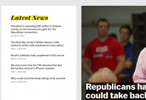
Vox’s homepage is not very eye-catching.

The category on the left is working well on Vox’s homepage. Under “Latest News” readers are given a list of headlines, in descending order from newest to oldest. Obviously, time of event is the organizing principle here. However, all of the headlines are the same exact size– which should I click first? By making readers work to read through the headlines, ever so slightly, Vox has risked losing attention. This is not a great strategy for drawing in online readers, who scan to find information.
The New York Times draws in the audience.

Somewhat ironically, the old and esteemed New York Times has a website homepage that is better than the young upstart Vox. The headlines are not only listed in order of how recently they’ve been published; but they also have different font sizes, so readers know what the most important story is. Some stories also have pictures accompanying the blurb, setting them apart from each other even more.
The lesson here is that you have to distinguish your most important information from the rest. Knowing how to organize your website visually means doing the work for your visitors. Otherwise, after all the effort that it took to attract people to your website in the first place, you’ll end up losing them before they start scrolling.


